
Hello again,
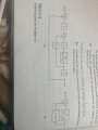
Do you think you can make that very first drawing a little more clear as to the lettering. I am having difficulty reading the text in that drawing.
When possible typing is always more clear because the lettering is more uniform. The only catch is when typing the upper case "i" which looks like a lower case "L" in some fonts. I suggest using the font type "Courier New" because there is no ambiguity with the lettering type.
The text that is hard to read is enclosed in red in the following drawing (top).
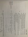
You can solve for Kt in the second drawing (bottom) but i dont think it will be unique.
Do you think you can make that very first drawing a little more clear as to the lettering. I am having difficulty reading the text in that drawing.
When possible typing is always more clear because the lettering is more uniform. The only catch is when typing the upper case "i" which looks like a lower case "L" in some fonts. I suggest using the font type "Courier New" because there is no ambiguity with the lettering type.
The text that is hard to read is enclosed in red in the following drawing (top).
You can solve for Kt in the second drawing (bottom) but i dont think it will be unique.
Attachments
-
 50.6 KB Views: 4
Last edited:
")


