High & Low Cut-off Frequency

Thread Starter

chrisjsmith

Joined Nov 12, 2016
41
Hello

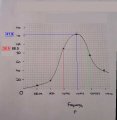
How would I determine the High cut-off and low cut-off frequency strictly from the graph i've attached without using calculations?

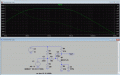
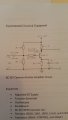
The graph was plotted using the first table "Original Value of Cc"

I calculated it to be Fcut-off= 1/2.Pie.R.C
Freq High Cut-off= 66kHz
Freq Low Cut-off= 26 hz

Im unsure if this is correct or not
 

Attachments

Thread Starter

chrisjsmith

Joined Nov 12, 2016
41
What is the usual definition of "cutoff frequency"?
From what i've searched i understand this the most
"The cutoff frequency is defined as the frequency at which the ratio of the (input/output) has a magnitude of 0.707. When this magnitude is changed to decibels –3dB mostly referred to as the 3dB down point."
 

WBahn

Joined Mar 31, 2012
29,979
From what i've searched i understand this the most
"The cutoff frequency is defined as the frequency at which the ratio of the (input/output) has a magnitude of 0.707. When this magnitude is changed to decibels –3dB mostly referred to as the 3dB down point."
Okay, so with that understanding, can you use your graph to find the upper and lower cutoff frequencies? Make your best attempt and explain how you got at your answers. Then, if they are wrong, we will be in a better position to help you correct them.
 

MrAl

Joined Jun 17, 2014
11,396
From what i've searched i understand this the most
"The cutoff frequency is defined as the frequency at which the ratio of the (input/output) has a magnitude of 0.707. When this magnitude is changed to decibels –3dB mostly referred to as the 3dB down point."
Hi,

That's right, but it does not explain the answers you provided earlier. Can you see why?
Hint: the 3db down points are referred to the "center" frequency which you may have calculated as one of the cutoff frequencies. So first you need to figure out the center frequency and then you will be in a better position to calculate or just read off the upper and lower cutoffs.
 

Thread Starter

chrisjsmith

Joined Nov 12, 2016
41
So i re-evaluated my answer and what I did. Here's my attempt
I got an estimate for my new frequencies to be

Fh= 400 kHz
Fl= 9.5 kHz

I took my frequency response values and multiplied by .707. The highest one and the lowest I took respectively, marked on the graph and read off the estimated frequency ?
 

Attachments

WBahn

Joined Mar 31, 2012
29,979
Those numbers appear reasonable. Notice that you can look at the original table and see that the lower -3 dB point is right at 10 kHz and the upper one is just below 500 kHz.

You've made doing it graphically very difficult because you do not have a consistent scaling on the frequency axis. For the lower frequencies you have 6 divisions per decade, but then when you go from 100 kHz to 500 kHz you use 6 divisions for an increase in frequency of five-fold and then you use 6 divisions for only a doubling of frequency as you go from 500 kHz to 1 Mhz.
 

The Electrician

Joined Oct 9, 2007
2,971
WBahn has advised students in other threads about how turning in a good looking lab report can help get a favorable response from your grader. Even though it appears that you have a ready-made chart for plotting your result, it's apparently not logarithmic. Have a look at what a frequency response done well on log paper looks like: https://www.bing.com/images/search?...pq=frequency response chart&sc=8-24&sp=-1&sk=

You can find printable logarithmic charts on the web: https://www.bing.com/images/search?...graph paper printable 8.5x11&sc=0-0&sp=-1&sk=

You could print a suitable one, plot your results on it and attach to your report. Your grader will be favorably impressed.
 

MrAl

Joined Jun 17, 2014
11,396
Hello again,

Here is a graphic that illustrates the technique a little more...
Note i used the original drawing because it had the grid. We really need that grid in this problem because of the way cameras sometimes distort graphic images.
 

Attachments

WBahn

Joined Mar 31, 2012
29,979
Hello again,

Here is a graphic that illustrates the technique a little more...
Note i used the original drawing because it had the grid. We really need that grid in this problem because of the way cameras sometimes distort graphic images.
The problem is that this technique relies on the interpolation between points being meaningful. That isn't the case if you draw a nice smooth line through the data but the data is not spread out properly on the horizontal axis.

You can plot the points properly by simply taking the base-10 log of the frequencies divided by some reference frequency (since the argument to the log function has to be dimensionless) and multiplying the result by the number of divisions you want per decade. Since the lower frequencies on this graph are plotted with six divisions per decade, let's stay with that.

Since the left edge of the grid corresponds to 10 Hz, we'll use that as the reference frequency. So 500 kHz would be plotted at 28.2 divisions to the right of the left edge (and 1 Mhz would be plotted at 30 divisions).

And, if properly scaled, you can go the other way, too. If the 3 dB point drops down to, say, 17.7 divisions, then this corresponds to a frequency of

f = f_ref * 10^(divisions/div_per_decade) = 10 Hz * 10^(17.7 div / (6 div/decade)) = 8.91 kHz
 
There's something wrong here. In one of the images in post #1, the TS's measured data is shown in tabular form. For the original value of Cc, the lowest frequency shown is 100 Hz, with a gain of 6. The table just below shows the result for a doubled value of Cc, again a gain of 6 but now at a frequency of 10 Hz. :confused: 
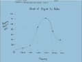
He's saying he got the same gain at 100 Hz as at 10 Hz with a small change in Cc? I don't think changing the value of Cc will have much effect at the low end.

The frequencies shown in those two tables are different in a couple of other places also.

I'm not sure I believe his circuit with the component values shown will behave like his measured results. Does one of our resident LTspice users feel like doing a simulation?
 

MrAl

Joined Jun 17, 2014
11,396
The problem is that this technique relies on the interpolation between points being meaningful. That isn't the case if you draw a nice smooth line through the data but the data is not spread out properly on the horizontal axis.

You can plot the points properly by simply taking the base-10 log of the frequencies divided by some reference frequency (since the argument to the log function has to be dimensionless) and multiplying the result by the number of divisions you want per decade. Since the lower frequencies on this graph are plotted with six divisions per decade, let's stay with that.

Since the left edge of the grid corresponds to 10 Hz, we'll use that as the reference frequency. So 500 kHz would be plotted at 28.2 divisions to the right of the left edge (and 1 Mhz would be plotted at 30 divisions).

And, if properly scaled, you can go the other way, too. If the 3 dB point drops down to, say, 17.7 divisions, then this corresponds to a frequency of

f = f_ref * 10^(divisions/div_per_decade) = 10 Hz * 10^(17.7 div / (6 div/decade)) = 8.91 kHz
Hi,

I assumed his graph was correct even though unusual and we did not have to be super accurate here.
I would say the idea of doing a simulation would be best. That way we could plot this right.

Here's a simulation but it shows a very different response. Check the values.
 

Attachments

Last edited:
I think an impedance greater than zero might make some difference if the TS isn't measuring the input voltage at the right place, but that wouldn't account for the large difference we see.

He will have to explain exactly what he's doing if we are to help him get a better result.

I wonder if he's plotting radian frequency rather than Hz?
 

Thread Starter

chrisjsmith

Joined Nov 12, 2016
41
The values from the table were tabulated and given to me by my lecturer. The real Lab simulation did not go as planned and yielded erroneous results so the values in the table for 2x the value of Cc can't be taken as gospel. I do appreciate the time you guys have taken to simulate and explain how to achieve proper scaling using the log graph which i'll try to implement in future labs...Much thanks againl :)
 

MrAl

Joined Jun 17, 2014
11,396
I think an impedance greater than zero might make some difference if the TS isn't measuring the input voltage at the right place, but that wouldn't account for the large difference we see.

He will have to explain exactly what he's doing if we are to help him get a better result.

I wonder if he's plotting radian frequency rather than Hz?
Hi again,

Well that's a good idea i think, but the ratio we are seeing here looks like around 100 to 1, which is so large i cant even begin to imagine what happened except maybe this was a completely hand written assignment where the teacher made up the graph or something. Maybe one of the component values is not right? I did not look into that yet.
 

MrAl

Joined Jun 17, 2014
11,396
The values from the table were tabulated and given to me by my lecturer. The real Lab simulation did not go as planned and yielded erroneous results so the values in the table for 2x the value of Cc can't be taken as gospel. I do appreciate the time you guys have taken to simulate and explain how to achieve proper scaling using the log graph which i'll try to implement in future labs...Much thanks againl :)
Hi,

How do you explain why we are seeing such a big difference between the simulation and the graph or the values your teacher gave you? Any ideas?
The teacher values are more important because that will determine your grade, but we were just wondering that's all.
 

Thread Starter

chrisjsmith

Joined Nov 12, 2016
41
I really can't honestly. The graph I plotted compared to what i've seen posted here are totally different while using the same components. Even my simulation using proteus 8 resembles what was posted but not the actual one plotted.
 

Attachments

WBahn

Joined Mar 31, 2012
29,979
So consider this an opportunity. Don't just use the data as given and chug out an answer. Definitely do that, to show that you CAN do that, but write up the discrepancy and what steps you've taken to show that there IS a discrepancy.
 
Top