There was bulletin posted on the boards and private emails sent to every corporate address that went something like this. "We are moving into the future and to reflect this we are announcing the development of a new logo. We are adapting a forward leaning rhombus to lead us in that direction". The red box was the new and improved logo.
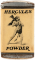
The old logo was Hercules himself wrapped in a lion skin and weilding a club ready to take on all comers. The employees were very upset with this change after nearly a 100 years of history with the Hercules image.
What the corporate bulletin did not say was that our logo had been sold!!! The comany had divested their reloading powders and the Hercules Logo when they were sold to Agilent Technology as Hercules Incorporated was moving to become the world leading specialty chemicals company. Within a couple of years Hecules Incorporated ceased to exist so that silly red rhobus was of no actual value at all but the Hercules Logo continues in the marketplace without them. Sad but true...
Both sides of these logo debates tend to take themselves way too seriously.
I was working for the National Bureau of Standards (NBS) back when they decided to change their name and the anger and outrage was palpable. I was at the Boulder Labs and the director himself had to come out from Gaithersburg and address the site employees because of all the unrest. While I was admittedly not too happy about the change, because NBS enjoyed a worldwide reputation that truly meant something and even most lay people understood that saying that something was NBS-traceable was valuable. So I was concerned that we were throwing that all away and, in some ways, starting over building a new reputation. But while a lot of people thought that was a long-term devastating event, I figured that it probably wouldn't take too long for the name NIST to take its place at the same level. I was guessing a decade or so, but I don't think it took nearly that long. I also remember how the powers-that-be were adamant that no employ pronounce the name, but instead would have to say the letters. This was because the word "nist" sounded odd and undignified. My thought at the time were twofold: (1) If an abbreviation can be pronounced as a word, it's going to be pronounced as a word (ask NASA, USAFA, NASCAR, and an enormously long list of organizations if you don't believe that), and (2) If you don't like how the abbreviation for the name you chose sounds, then why did you choose it?
But the big reason that I was opposed to the change was because I saw absolutely no need or value in doing so, but I couldn't help but wonder what the cost to the taxpayers had to be, both in all the consultants and lawyers involved before the change, and in the actual cost or replacing signs and letterhead and stamps and decals and everything else that had the NBS name and logo on it.
At that meeting, the director went out of his way to mock and denigrate the existing logo and tout how the new logo was so much more modern and forward thinking. I was quite turned off by that. It was nothing more than a gratuitous attempt at emotional manipulation trying to break the employees attachment to the symbols of an organization to which they had dedicated themselves and that had a history that they every right to be proud of.
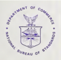
Here's the original logo (actually, it may or may not truly be the original -- the name itself was changed three times, first National Bureau of Standards, then just Bureau of Standards, then back to NBS, and then to NIST.
He said things like (rough paraphrasing -- it's been nearly four decades), "Oh, a bird. Who doesn't like birds. Yeah. I'll miss that, too. And then there's a beautiful sailing ship representing our modern fleet. And what kind of organization wouldn't want a lighthouse shining out to the world for them."
Interesting, I had been in the NSB supply store earlier in the day and we were talking about the upcoming briefing by the director. The manager wrote out a list of sixteen buzzwords that he expected to appear in the presentation. I don't remember them all, but it was the typical PC stuff of the day, like "empowerment", "diversity", "awareness", "self-esteem", "inclusive", "holistic", "stakeholders", "equity". I know most, if not all, of those were on the list. I sat through the presentation checking them off and, of the sixteen words, he got all but three (and I can't remember which three). I have often wished I had saved that piece of paper.
I asked Copilot to draft a 1980s' PC-laden paragraph along these lines and it hit the tone pretty damn close:
"As we transition from the National Bureau of Standards to the National Institute of Standards and Technology, we embrace a more holistic, forward-looking identity — one that reflects our commitment to innovation, inclusivity, and stakeholder empowerment. The old NBS logo, with its rigid lines and monochrome palette, may have served its purpose in a more hierarchical era, but it no longer aligns with our values of diversity, collaboration, and cross-disciplinary synergy. This change isn't just cosmetic — it's a strategic pivot toward a more culturally responsive and globally engaged mission. We're not just measuring things anymore; we're facilitating transformative outcomes across sectors, empowering communities, and fostering a climate of continuous improvement."
Logos do posses value.
Exhibit A; General Motors, its underlined GM in capital letters was simple, straightforward and yet universally recognized as the World’s premier automobile company for almost 8 decades.
Nowadays, with its lowercase gm with a single underline in a pale blue, it means exactly what? That the company finally recognizes it has shrunk to a shadow of its former self?
People forget how immense and powerful GM was in its heyday.
In the late 1960s there was a magazine in Mexico, Contenido, basically a format clone of Reader’s Digest.
In one article, it described General Motors, and I clearly remember that its budget was larger than that of Mexico’s federal government.
No small feat, Mexico at the time was an oil exporter powerhouse.
I still think that Hewlett Packard execs blew it when they gave the HP trademark to their PC division and changed the name of their instrumentation division to Agilent. It fizzled so badly that they had to re-brand again to Keysight. Any scientist or engineer knew that HP was the Toyota of instrumentation. Why blow that reputation by tying the name to crappy PC's. My two cents is that they should have kept the Compaq name for the PC line and never changed their instrumentation brand away from Hewlett Packard.

 Facebook
 Google
 GitHub
 Linkedin