 Facebook
 Google
 GitHub
 Linkedin
Upon launch of the new site, I immediately found it's form and function lacking for me. So I switched back... I have every intention of switching over after some of the bugs had been worked out.
Today, I saw a thread about Arduino articles, which provided the following link:
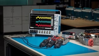
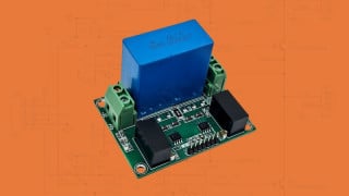
http://www.allaboutcircuits.com/latest/arduino/
Let me start by saying that 99% of my activity is done on a SmartPhone.
I couldn't, without great difficulty, use the page nor read the article I wanted.
First, the banner took up approximately 25% of my screen. This made it impossible to view the article pictures, because they were so bug.
Second, I couldn't scroll down the page since the edge to edge pictures served as a link. When trying to scroll down to an article, I'd inevitably link to a previous article.
Third, when scrolling, the browser would display navigational headers and footers further limiting my viewing area to less than half of my screen. Impossible to view any embedded content.
Obviously (to me) the new format needs to address mobile users.
P.S. Orange is the new blue. I can deal with it generally!
Today, I saw a thread about Arduino articles, which provided the following link:
http://www.allaboutcircuits.com/latest/arduino/
Let me start by saying that 99% of my activity is done on a SmartPhone.
I couldn't, without great difficulty, use the page nor read the article I wanted.
First, the banner took up approximately 25% of my screen. This made it impossible to view the article pictures, because they were so bug.
Second, I couldn't scroll down the page since the edge to edge pictures served as a link. When trying to scroll down to an article, I'd inevitably link to a previous article.
Third, when scrolling, the browser would display navigational headers and footers further limiting my viewing area to less than half of my screen. Impossible to view any embedded content.
Obviously (to me) the new format needs to address mobile users.
P.S. Orange is the new blue. I can deal with it generally!

